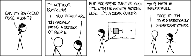
So Andrew Gelman hates box plots. Not that you should give a buck what Gelman thinks. I’m just setting this blog post up, OK. So stick with me. Gelman also thought this XKCD cartoon was NOT funny :
There’s some correlation as well as causation. I could be wrong, but I suspect that the reason Gelman does not like the XKCD cartoon is because he’s very literal, as geeks can be. Trust me, my wife is married to a geek. It probably also has something to do with how much Gelman hates box plots. He hates them so much that he is holding a contest to see if anyone can prove to him that a box plot is an appropriate way to show something. I don’t think I can persuade him that box plots are ‘appropriate’ as that sounds like a matter of taste… like when I break wind at the breakfast table and my wife says, ‘that’s not appropriate.’ However I can demonstrate the ease at which one can make box plots, and my preferred violin plots using R.
So stick with me and I’ll give you some free code to take home and try!
Here’s the type of thing you see a lot with box plots:
That produces output like this:
[caption id="attachment_163” align="alignnone” width="300” caption="Box Plot”]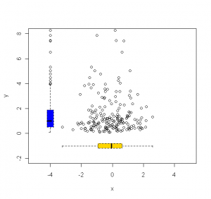 [/caption]
That’s kinda cute. You can see the log normal shape of y and the normal shape of x. An alternative would be to use a violin chart using the following syntax:
I kept the values for X and Y the same, but the new plot looks like this:
[caption id="attachment_164” align="alignnone” width="300” caption="Violin Plot”]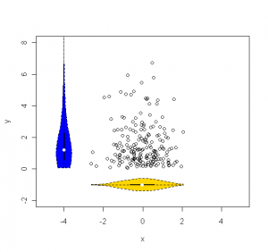 [/caption]
I like that a little better. The violin plot captures the shape of the density mass function (PDF). But in both of these examples we would probably be just as well off if we simply plotted the PDF instead of either the violin plot or the box plot. So they aren’t really adding anything. So is Gelman right, the box/violin plot is useless? Here’s what I think it IS good for:
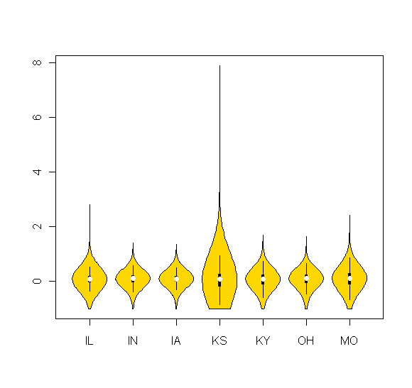
These are plots of state crop yields in terms of deviation from an expected trend. So 0 on the Y axis means no deviation from trend and 2 is 200% better than trend and you just can’t do any worse than -100% below trend. I look at this type of stuff all the time, and a box or violin chart is really nice because I can lay out a bunch of states along the X axis and look at how they compare. It’s easy to compare all the moments of the distributions visually. We can easily see that most states have a mean around 0, but Kansas has MUCH more dispersion as well as a lot of skew. And since you are wondering, no, I didn’t force the symmetry you see in the graph, it just turned out that way. Luck put Kansas in the middle and luck gave MO and IL the same relative tail. shrug sometimes this stuff just looks good. Kinda like me!
Here’s the same info as above but in a box plot:
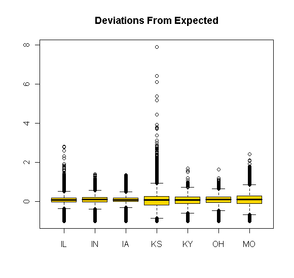
I think the violin plot is more elegant, but the box plot is still OK, albeit rather noisy and less elegant.
So that’s all the free code you get from me today. Try not to spend it all on candy this time, OK?