 Over at stats.stackexchange.com recently, a really interesting question was raised about principal component analysis (PCA). The gist was “Thanks to my college class I can do the math, but what does it MEAN?”
I felt like this a number of times in my life. Many of my classes were focused on the technical implementations they kinda missed the section titled “Why I give a shit.” A perfect example was my Mathematics Principles of Economics class which taught me how to manually calculate a bordered Hessian but, for the life of me, I have no idea why I would ever want to calculate such a monster. OK, that’s a lie. Later in life I learned that bordered Hessian matrices are a second derivative test used in some optimizations. Not that I would EVER do that shit by hand. I’d use some R package and blindly trust that it was coded properly.
So back to PCA: as I was reading the aforementioned stats question I was reminded of a recent presentation that Paul Teetor gave at a August Chicago R User Group. In his presentation on spread trading with R he showed a graphic that illustrated the difference between OLS and PCA. I took some notes and went home and made sure I could recreate the same thing. If you have wondered what makes OLS and PCA different, open up an R session and play along.
Your Independent Variable Matters:
The first observation to make is that regressing x ~ y is not the same as y ~ x even in a simple univariate regression. You can illustrate this by doing the following:
y <- 20 + 3 * x e <- rnorm(100, 0, 60) y <- 20 + 3 * x + e
plot(x,y) yx.lm <- lm(y ~ x) lines(x, predict(yx.lm), col="red”)
xy.lm <- lm(x ~ y) lines(predict(xy.lm), y, col="blue”)
You should get something that looks like this:
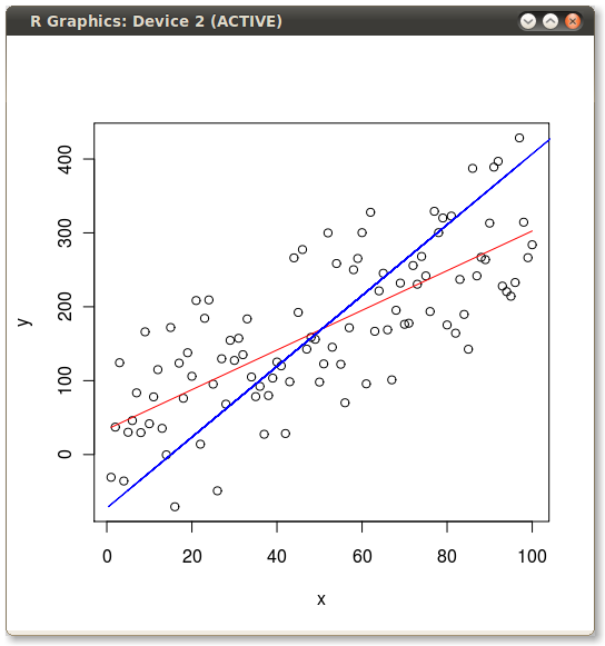
So it’s obvious they give different lines. But why? Well, OLS minimizes the error between the dependent and the model. Two of these errors are illustrated for the y ~ x case in the following picture:

But when we flip the model around and regress x ~ y then OLS minimizes these errors:
Ok, so what about PCA?
Well let’s draw the first principal component the old school way:
#covariance xyCov <- cov(xyNorm) eigenValues <- eigen(xyCov)$values eigenVectors <- eigen(xyCov)$vectors
plot(xyNorm, ylim=c(-200,200), xlim=c(-200,200)) lines(xyNorm[x], eigenVectors[2,1]/eigenVectors[1,1] * xyNorm[x]) lines(xyNorm[x], eigenVectors[2,2]/eigenVectors[1,2] * xyNorm[x])
the largest eigenValue is the first one
so that’s our principal component.
but the principal component is in normalized terms (mean=0)
and we want it back in real terms like our starting data
so let’s denormalize it
plot(xy) lines(x, (eigenVectors[2,1]/eigenVectors[1,1] * xyNorm[x]) + mean(y))
that looks right. line through the middle as expected
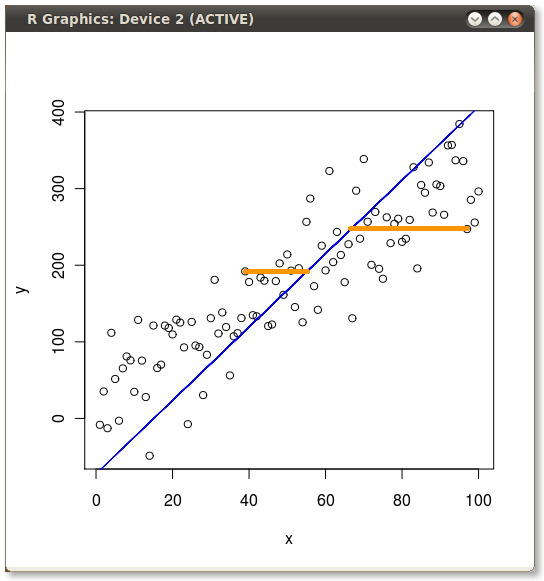
what if we bring back our other two regressions?
lines(x, predict(yx.lm), col="red”) lines(predict(xy.lm), y, col="blue”)
PCA minimizes the error orthogonal (perpendicular) to the model line. So first principal component looks like this:
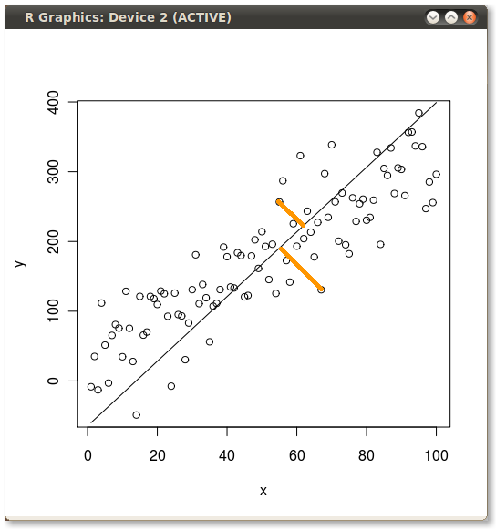
The two yellow lines, as in the previous images, examples of two of the errors which the routine minimizes.
So if we plot all three lines on the same scatter plot we can see the differences:
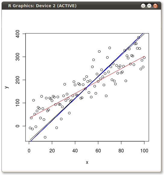
The x ~ y OLS and the first principal component are pretty close, but click on the image to get a better view and you will see they are not exactly the same.
All the code from the above examples can be found in a gist over at GitHub.com. It’s best to copy and past from the github as sometimes Wordpress molests my quotes and breaks the codez.
The best introduction to PCA which I have read is the one I link to on Stats.StackExchange.com. It’s titled “A Tutorial on Principal Components Analysis” by Lindsay I Smith.